A campaign yard sign has one job, and it does that job in about two seconds from twenty or thirty feet away, usually while the person reading it is walking a dog or slowing for a stop sign. That constraint should drive every design decision, and yet most first-time signs are laid out on a laptop screen at arm’s length, where a thin font and a paragraph of text look perfectly fine. They are not fine on a lawn. Designing a sign that actually gets read is less about taste than about a few measurable rules tied to distance, speed, and contrast.
Design for the distance, not for the desk
The governing rule in signage is roughly ten feet of readable distance for every inch of capital letter height. A three-inch letter is comfortably legible at about thirty feet; a five-inch letter reaches roughly fifty feet; and to be read from 150 feet away you would need letters around fifteen inches tall, which no standard yard sign can hold. The relationship is linear and unforgiving, and it is the first thing to internalize before you open a design tool.
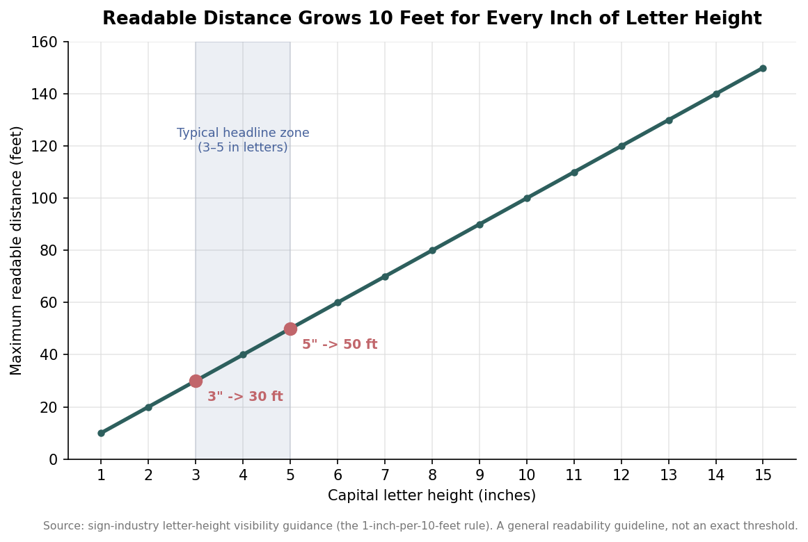
What this means in practice is that a candidate name set in a modest font, the kind that looks bold on screen, may only be readable from ten or fifteen feet on the actual sign. Treat the ten-feet-per-inch figure as a general guideline rather than a precise cutoff, but respect its direction: when in doubt, the letters are too small, not too big. The most common design mistake is filling the sign with words at a size that assumes the reader is standing still and close, when in reality they are moving and far.
Size the headline to the road, then let everything else follow
For a standard 18-by-24-inch yard sign, the primary line, almost always the name, should be at least three to five inches tall, with any secondary line, an office sought or a short tagline, around two to three inches. That hierarchy is not decorative. It tells the eye what to grab first in the fraction of a second it has, and it keeps the sign legible at the distances a lawn placement actually delivers. If the name and the office are the same size, the sign reads as a wall of text and the eye bounces off it.
Word count follows directly from letter size. A headline of five to seven words is the practical ceiling, and fewer is better. A name and an office is often the entire useful content of a yard sign. Every additional word you add competes for the same fixed area, which forces the type smaller, which shrinks your readable distance. Websites, slogans, and disclaimers belong in the smallest tier if they appear at all, because a reader who cannot finish the sign in one pass will not stop to study it.
You are designing for two seconds, not two minutes
A driver moving at 25 miles per hour has only about two seconds of usable time on a roadside sign. That window is not a preference; it is arithmetic. As speed rises, the seconds fall away quickly, and by highway speeds a sign meant to be read from a passing car has effectively no chance unless the letters are enormous. The chart below models the readable window against speed for a typical headline size, calibrated to that roughly two-second figure at 25 miles per hour.
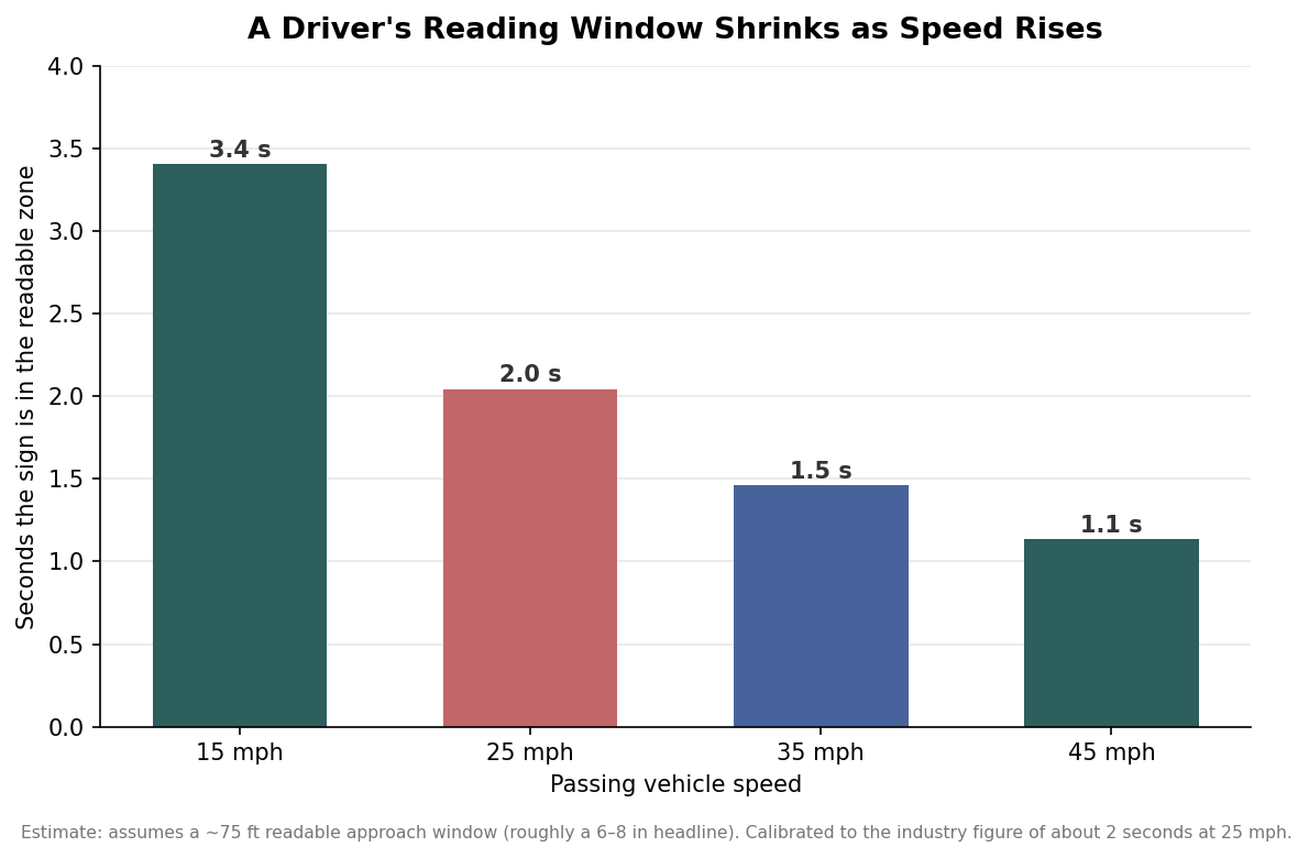
The takeaway is to match the sign to where it will actually stand. A sign on a quiet residential lawn, read by pedestrians and slow traffic, can carry a little more information because the reader has time. A sign on a 40-mile-per-hour arterial has to be almost violently simple, a name and nothing that requires a second glance. Designing one sign to serve both placements guarantees it underperforms in at least one of them. If your plan includes higher-speed roads, that is an argument for a larger sign and a shorter message, not for cramming the same layout everywhere.
Contrast does more work than color choice
Legibility at distance is driven by contrast between the text and its background far more than by which colors you pick. Dark text on a light field, black or navy on white or yellow, or crisp white text on a dark field are the combinations that hold up outdoors. The pairings that fail are the low-contrast ones: red on brown, blue on green, and any pastel-on-pastel scheme that looks sophisticated on a monitor and turns to mud on a lawn in flat afternoon light. One practical caveat is that bright warm colors like yellow and orange can wash out in direct sun, so if a light background is in play, lean toward darker, denser letter colors to keep the edge sharp.
Font choice reinforces contrast. Bold sans-serif faces built for impact, the Impact, Arial Black, Bebas Neue, and Helvetica Bold family of shapes, carry weight at distance because their thick, even strokes stay solid as they shrink in the eye. Thin, decorative, or script fonts do the opposite; their fine strokes break up and blur, which forces you to set them larger to stay legible and costs you the space you needed for the name. If a stylish typeface is important to the brand, reserve it for the smallest tier and let a workhorse font carry the headline.
Pick a sign size that matches where it will stand
The 18-by-24-inch sign is the default for a reason: it holds a three-to-five-inch name comfortably and fits standard wire H-stakes, which keeps unit costs down at the quantities a campaign needs. Step up to 24-by-36 inches when the sign will sit farther from the sightline or along faster roads, where the extra area buys you the letter height that distance demands. The decision is not about prestige; it is about whether the placement gives the reader enough letter height to finish the sign in the seconds they have.
Design the sign backward from the moment it is read. Decide the farthest distance and fastest speed it must survive, size the name to that distance using the ten-feet-per-inch rule, cap the message at what fits without shrinking the type, and choose the highest-contrast color pair you can live with. Do that, and the sign works on the lawn instead of only on the screen.